August 23, 2008, on the libertarian website Vrijspreker, Labohm presented a graph showing "for the past decades, there's no correlation between CO2 and temperature"


But finally he also presents this graph which is the one we need :

This image leaves no doubt that indeed there is a correlation between CO2 and temperature. And that because of its short time interval, the first graph Hans Labohm presented was misleading. Which of course could be undeliberately and by no means is a proof of dishonesty.
Yet, in the third edition of Jason Magazine (jg 33), Hans Labohm presents this graph
he 'explains' :there's no a single correlation between temperature & CO2 (...) there's not a single timescale showing a correlation between CO2-concentrations in the atmosphere and temperature.Of course, as the third graph above (a graph he himself posted) already showed, there absolutely is a correlation.
In the next edition of the magazine, Dutch student Desi Van de Laar wrote a rebuttal to Hans' text. In which she posts a graph showing the correlation.
The graph looks a bit like this one :
Clearly, this is the second time Labohm has been shown his statement is false.
Hans wrote a rebuttal (jan 6, 2009) adressing Van de Laars rebuttal. A text he concludes with :
the last decade earth has been cooling, despite a CO2 rise. This presumably leads to the conclusion that CO2 isn't such an important factor in determing earth's temperature.He present a graph to depict his words :
This is the second time he ignores the proof presented to him that his statement is false.
Back then, i did blog about it (posts he read), which means he's seen the evidence he's wrong no less than three times.
February 13, 2009 : Labohm writes a post on De Dagelijkse Standaard in which he writes :
The main thing is that since ten years earth has stopped warming while CO2-levels kept rising. This suggests there's not any causuality between CO2 and global warming (which isn't there any more anyway). Better than a thousand words, this graph shows what it's all about.The graph hidden under the hyperlink is this one :
In the comments section, someone complains the time interval Labohm presents is way too short to be meaningful.
The same day Hans Labohm wrote this follow up post to adress this comment in which he answers :
Good point ! But no time scale will ever show a correlation between CO2 and Temperature. QED. P.ex. Look hereOf course, Hans' statement is wrong. And he knows very well that it is.
March 4, 2009 :Labohm publishes a post on De Dagelijkse Standaard which begins with :
(...) the temperature trend (which - i'll repeat it once more - shows no correlation with the level of atmospheric CO2) (...)
Once again Labohm is critisized by the readers of the site for his graph the commenters call 'misleading'. Hans replies by giving a link to this graph :
and this graph
So once again, Labohm HIMSELF presents the graph which clearly shows the correlation.
Interestingly, in this post he admits a ten year period is too short to support his claim that earth stopped warming a decade ago.
March 12, 2009 : Hans mailes around an article of his - published in the March-edition of the magazine Research Review.
Hans writes (remember, on DDS he admitted that a ten year temperature trend is meaningless) :
The illustrated graph shows declines in temperatures measured by surface and satellite thermometers over the last 10 years, while the CO2 concentration in the atmosphere still rises. It indicates that over this period there has been no warming, but cooling. It also shows that CO2 is not correlated with temperatures, which suggests that it has only little impact, if at all. The graph, which is based on the measurements of the official scientific institutions, is the best-kept secret of the ‘warmoholics’.of course there's a graph (coming from the known unreliable source icecap from Joe d'aleo) to picturise Hans' words
i'm wondering which graph will accompany my next post on Hans Labohm...
UPDATE 1: March 13, 2009, in the comments section of De Dagelijkse Standaard, Labohm writes :
Not one timescale -millions of years, thousands, hundreds or tenths of years- shows a correlation between CO2 and temperatures.
UPDATE 2: March 17,2009 , Hans did it again in his post on De Dagelijkse Standaard :
Not one timescale -millions of years, thousands, hundreds or tenths of years- shows a correlation between CO2 and temperatures.The graph behind the hyperlink is ...
Do notice he does NOT provide links for the other timescales.
Which is no surprise, as he has demonstrated himself that such graphs actually would disprove his statement.
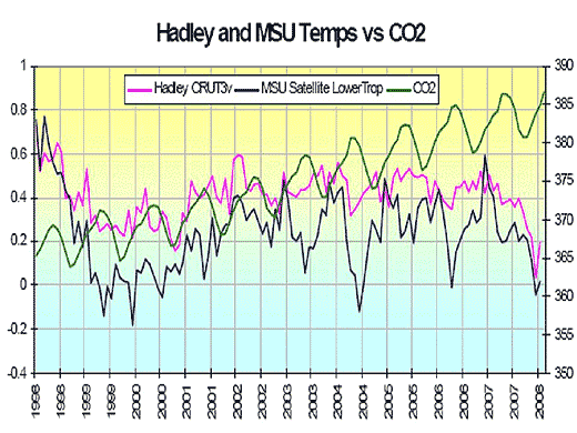
UPDATE 3 : March 24, 2009, Hans Labohm did it again :
no timescale shows a correlation between CO2 ans temperature. The last ten years earth has been cooling while cO2-levels kept rising.The illustration behind the hyperlink is this one :
UPDATE 4 : April 21, 2009, Hans Labohm presents a familiar graph :

UPDATE 5 :
i've stopped updating this post for half a year because i got bored, but allover this period Labohm has been using the very same "argument" over and over again.
Latest attempt to fool the audience : today, November 9, 2009, in this post on De Dagelijkse Standaard, accompanied by a graph we all know by now .
Labohm writes :
UPDATE 6 :
November 16, 2009 In a guestlog on the Dutch NOS site, Hans Labohm writes :
UPDATE 7 :
Last weekend, Labohm publised an article in the Dutch newspaper "Trouw". A prominent place in the article went to this graph :
UPDATE 8 :
December 14 2009
This page, by far, is the most visited one on my blog and as a result more and more people start asking Labohm why he keeps on using that misleading graph again and again.
Of course Hans never answers that question. But as he did get so much opposition on the NOS-weblog, he started trying other graphs that are equally misleading.
Labohm's posts belong to a series of a debate between him and real scientists. Bart Sprengers used the opportunity to write a post asking Labohm about his use of misleading graphs.
Here's what Labohm answered :
I have a feeling this is not the last time seeing this new graph...
UPDATE 5 :
i've stopped updating this post for half a year because i got bored, but allover this period Labohm has been using the very same "argument" over and over again.
Latest attempt to fool the audience : today, November 9, 2009, in this post on De Dagelijkse Standaard, accompanied by a graph we all know by now .
Labohm writes :This graph illustrates (...) there's no correlation between CO2 & temperature, implying one can assumle there's no causality either.
UPDATE 6 :
November 16, 2009 In a guestlog on the Dutch NOS site, Hans Labohm writes :
The average temperature has been decreasing the past ten years, while CO2-levels int he atmosphere is still risingThis words are illustrated with this graph :
UPDATE 7 :
Last weekend, Labohm publised an article in the Dutch newspaper "Trouw". A prominent place in the article went to this graph :
UPDATE 8 :
December 14 2009
This page, by far, is the most visited one on my blog and as a result more and more people start asking Labohm why he keeps on using that misleading graph again and again.
Of course Hans never answers that question. But as he did get so much opposition on the NOS-weblog, he started trying other graphs that are equally misleading.
Labohm's posts belong to a series of a debate between him and real scientists. Bart Sprengers used the opportunity to write a post asking Labohm about his use of misleading graphs.
Here's what Labohm answered :
Bart asks : why did you show a graph showing temperatures in US, while the text was suggesting it would be about global temperatures ?Answer : it was graph that was easily available on the internet. But now i found another graph, showing a different picture. No correlation between cO2 and temperature !
I have a feeling this is not the last time seeing this new graph...
UPDATE 9 :
june 6, 2010
Once again i haven't been following Labohm but i just stumpled upon his presentation at the fourth international climate conference organised by the heavily Exxon-funded Heartland Institute. In his presentation, Labohm is showing the following graph to 'proof' there's no correlation between CO2 and temperature :
Conclusion
In his posts, Hans Labohm is presenting misleading facts, and given the chronology mentioned above, there's not doubt at all he isn't fully aware of the misleading nature of the facts he presents.
Hans Labohm is not wrong, Hans Labohm is a fraud.
In his posts, Hans Labohm is presenting misleading facts, and given the chronology mentioned above, there's not doubt at all he isn't fully aware of the misleading nature of the facts he presents.
Hans Labohm is not wrong, Hans Labohm is a fraud.
.jpg "Hans Labohm funding")